What is data journalism?
Data journalism helps to tell a story with data and visual elements in an interactive way. More specifically, we tell a story with its data angle; we use different kinds of visual elements to create experiences to help our readers get through either complicated concepts or large, messy datasets.
People working in this field are widely known as “journocoders,” or journalists who code. NBC News’ Digital Data/Graphics Team comprises of data editors, data reporters, interactive journalists and researchers. We know a combination of journalism, data and programming, and produce original stories with data angles, come up with pitches for improving visual storytelling, maintain databases regularly used across all NBC News platforms and work on graphics and visuals closely with every news unit and investigative team. In our day-to-day work, we work closely with editors within the team or across the digital platform to acquire and understand data, go over visual ideas and walk through data analysis.
More specifically, I create content including maps, information graphics, dynamic interactive charts and cross-format, multimedia story features. I spend time scraping, cleaning and analyzing data, and presenting my takeaways and pitching visual ideas to the Data/Graphics team or reporters and editors. We get a decent chunk of time to bring our ideas from sketch to production, from a draft to a published interactive project.
What projects have you worked on?
Our short-term projects could include an informative locator map of a shooting location or wildfire. We also maintain graphics showing continuous unemployment rate changes or Covid-19 cases across the United States.
Long-term projects normally take a longer time to produce and piece together. It’s normally a feature story originally from our team or other teams under the NBC News platform.

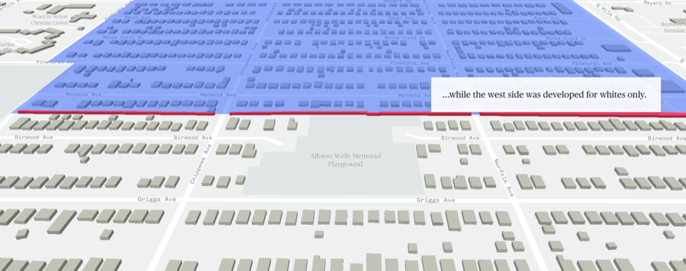
One of the projects that we recently published is about how a segregation wall built 80 years ago is still impacting neighborhoods in Detroit, Michigan. This project’s engaging visual experiences took roughly two months to prepare, report and create. Considering the topic is about a wall, we wanted people to see the wall and the surrounding area as they were and how they are today. I went through historic documents with reporters and editors and built a 3D model of the wall at its exact location. We used a scroll tool to shade each side of the wall to tell stories.
The most challenging part of this story is explaining how segregation is still impacting this community. One data angle I came up with is charting the racial makeup of neighborhoods over time. We started in 1930, a few years before the wall was erected, and ended with the latest census data. I used different colors to represent white and Black households, and positioned them based on census block shapes. Visually, we saw that white families moved out of the city while more Black families stayed in Detroit. We also overlaid home value data, to show home prices are significantly higher in white neighborhoods nowadays compared to Black neighborhoods.

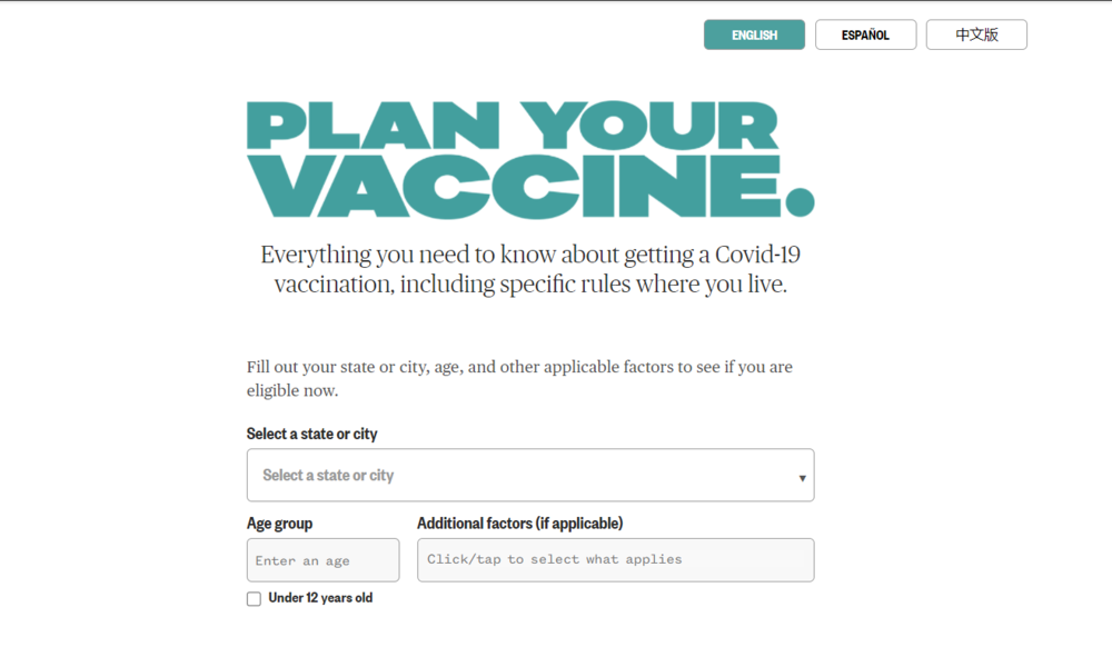
Beside visual data stories, we also deliver useful service journalism to our readers by creating essential tools responding to the news cycle. Earlier this year, our team pitched and published a cross-platform project called Plan Your Vaccine. It’s a digital tool that allows you to customize and get your state’s latest vaccination information. In the early stage of vaccine distribution, each group’s eligibility was very different and policies varied from state to state. We started with a lot of our own questions as residents, and thought about what our readers wanted to know. We designed this tool and aimed to bring the latest vaccine information to readers across the country.
Collecting vaccination policies for the whole country took a lot of research work. I worked closely with a team of researchers who tirelessly contacted the local health department to get the latest eligibility information in each state. I organized their data and turned it into a well-designed page with questions and answers, maps and search tools. Another big feature of this tool was Spanish and Chinese-language versions. That required a lot more communication and data collection between us and translators.
How did you get into journalism?
I started my career in journalism as a daily news reporter for a local daily newspaper in Shanghai, China. That’s where I wrote local stories and practiced storytelling. Soon after that, I went to graduate school at the University of Miami and found my interest in data reporting. Then I went to the Lede Program in Columbia Journalism School and majored in data journalism.
I started with NBC News in 2017, where I started to collaborate on a broader platform with all teams. I get to be involved in both small and large projects, covering elections, inaugurations and all the familiar news cycles but from a data and visual angle.
What skills do interactive journalists need?
To be an interactive journalist, you need to know some basic data analysis skills. This helps you get into messy data and come up with a clear takeaway, even if the data or concept is complicated. You must also have some basic visualization skills or understanding of charts. Visualization involves more than coding or programming, such as learning how to use open-source tools.
It’s important to remember that an interactive journalist is still a journalist. Everything you crave from data needs to be told with narratives. Immerse yourself into the visual story and practice storytelling.
A lot of an interactive journalist’s skills are not learned at school but gained through work experience. There’s always new things to learn and new ways to present data, but always make sure that what you are presenting is accurate and easy to comprehend. Don’t sacrifice function just because you want to have all the bells and whistles.


